Website Design That Sells a Venue Before the Visit
 Mr. Chandan KumarGuest· 14 April 2026· 1 min read
Your website is the first walkthrough of your hall — and the family decides whether to visit within a few seconds of it loading. Design isn’t decoration here; it is the difference between an enquiry and a bounce to the next venue.
What a venue site must do in the first screen
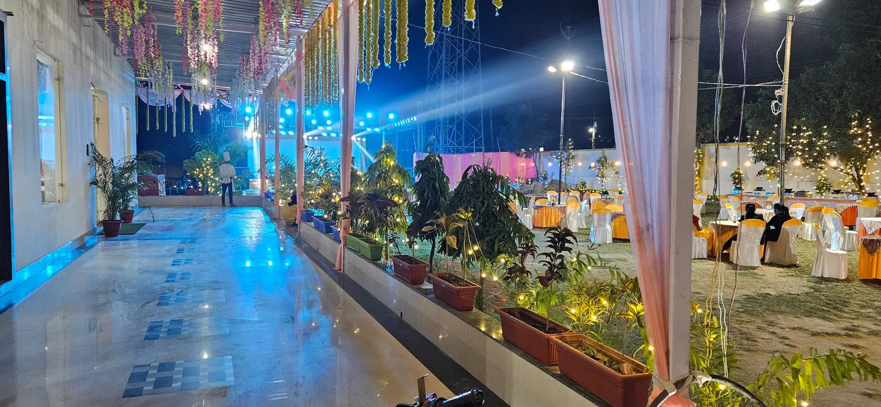
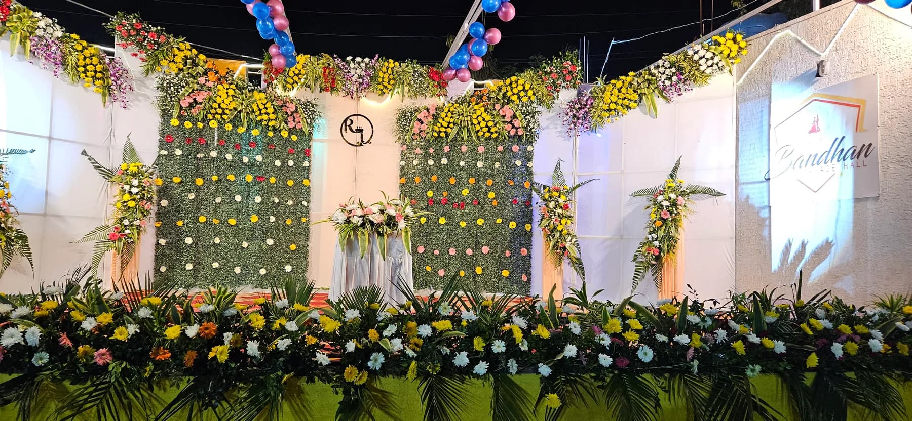
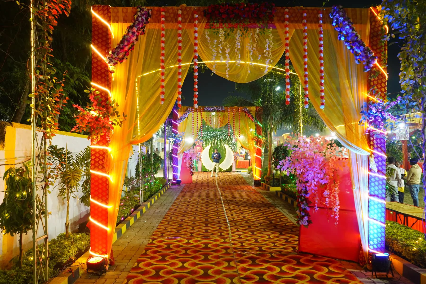
- Show the hall dressed for a real event, not an empty room
- State the one thing that matters most — capacity, location, in-house catering
- Put ‘Check a date’ / WhatsApp within thumb’s reach, on every screen
- Load fast on a mid-range phone on mobile data — most visitors are on 4G
Trust is a design decision
Real photos, genuine reviews, clear pricing tiers and an obvious phone number quietly answer the question every family is really asking: ‘can I rely on these people with the most important day of our lives?’ Clutter and stock imagery erode that trust without a word.
One clear path, not ten
Every page should lead to a single next step. When a site tries to do everything, visitors do nothing. A calm, guided layout that ends in ‘check your date’ will out-convert a busier, prettier one every time.
Getting that balance of beauty and clarity right is a craft — thoughtful web design & UI/UX is what turns a good-looking site into one that actually books events.
Recommended resource
Going deeper on this? See web design & UI/UX by Global Info Edge.
Guest post by
Mr. Chandan Kumar
Founder & Performance Marketing Director · Global Info Edge
Chandan Kumar is the founder & performance-marketing director of Global Info Edge, with 17+ years in digital marketing. He has managed crores in ad spend across Google and Meta and generated 5M+ leads for travel, healthcare, real estate, D2C and local businesses. He helps local businesses like Bandhan Marriage Hall get found and booked online — through local SEO, Google Business Profile and conversion-focused websites.
17+
Years experience
5M+
Leads generated
10k+
LinkedIn network